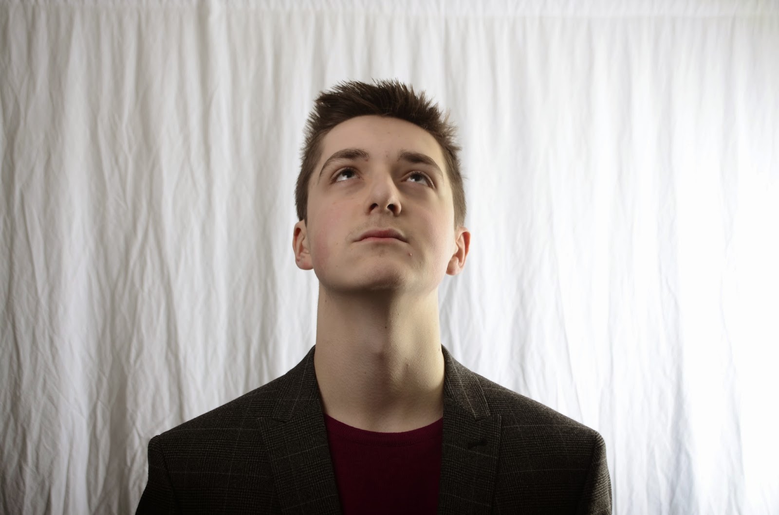
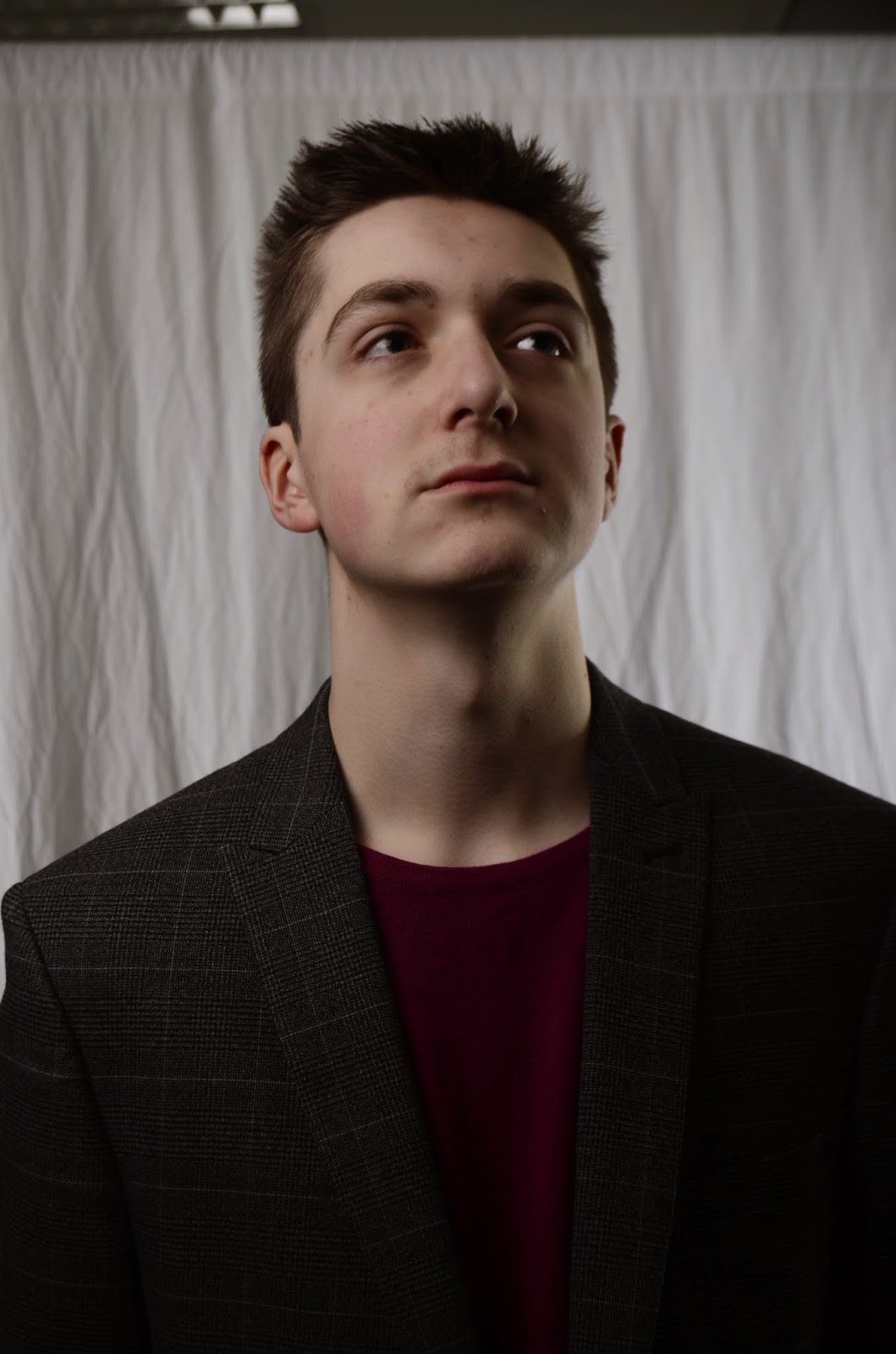
First of all i had gone out and taken some brand new photos and i used the same model and i had taken inspiration from the front cover containing Calvin Harris by mixmag. I have done this by making ryan give a similar stance with a very serious face as well as going for similar clothes, like Blazer, Pink Shirt, hair style. This is going to be the photo that i am going to be using for my front cover because i was really happy with the overall quality of the image as well as the lighting being really nice the only thing i have changed is by removing the glasses because they did not work as well as i wanted.
Thursday, 9 April 2015
Update on front cover
I have changed the layout of the front cover with there being a brand new photo which i have added because i was not happy with the overall quality of the image and i was not happy with the way he was positioned and what he was wearing. Down below i have shown what i have changed and how i have improved it:
Wednesday, 8 April 2015
New Photo's added to double page spread
In my double page spread i have decided to add a new photo in the bottom right of the page which works well and fills up the space well and i have stuck with the same story and same background picture because I feel like they work well and match my theme.
New Font Style
I have managed to include new font styles on my contents page and front cover. I have shown this on my contents page by having new text style down the side and with my front cover i have managed to include it everywhere across my page to make it look really attractive.
Tuesday, 7 April 2015
Double Page Spread update on story
Whilst i was checking my double page spread i was reading through the article that i had written and i came to the conclusion that it will need improving. To start with i felt that the story was too short and because it has been based on an interview i do not think there were enough questions asked and not enough detailed responses. Furthermore i feel i haven't given Ryan enough of a back story and because it is all about him he needs more information. Finally after doing some research into other fellow magazines i felt like trying to in cooperate some other people/artists to try and keep readers interested instead of becoming bored and unwilling to read more. I will be meeting all of my aims by going out doing further research on what questions to ask and what most readers will enjoy reading because even though i did some research earlier on in the year i feel it was not as useful as it should of bin.
New Style to my contents page
With my new structure to my Contents page i felt like changing some of my fonts around and see whether or not it works. After i replaced everything and moved the title's around i have used the fonts "Invaders", "Lucida Handwriting" and "Hobo STD". this is currently what my contents page looks like:
Monday, 6 April 2015
Explanation to why i kept the background white
After i handed in my rough cut version of my magazine i received feedback from people online and the number 1 improvement they advised was to fill the space. Now normally i would look to improve this but in order to gain marks i must take inspiration from a magazine that is already existing. The Magazine below is the one i have taken inspiration from:

As shown above i have tried to go along similar routes to help me gain as many marks as possible. The main part of the magazine that i have taken inspiration from is the white colour and the body positioning and mise-en sen.
Therefore i will be staying with the overall style of my front cover but i will be making modifications to the image and logo.
Sunday, 5 April 2015
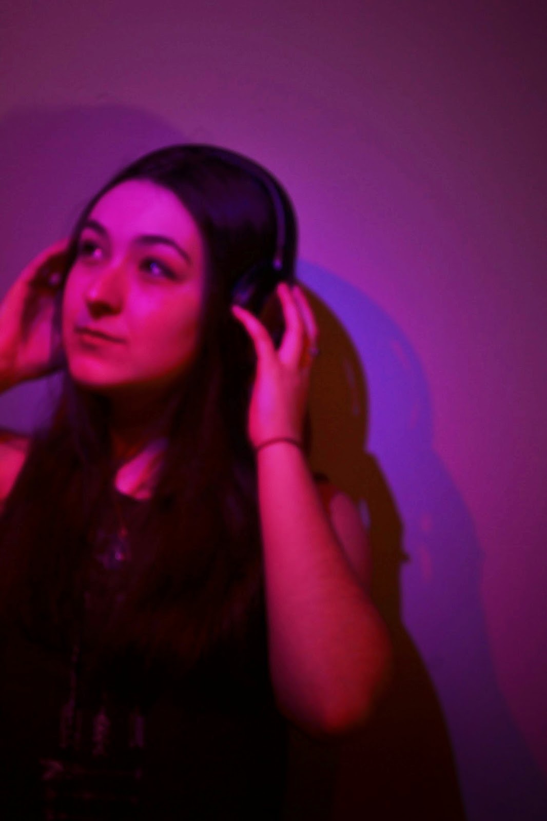
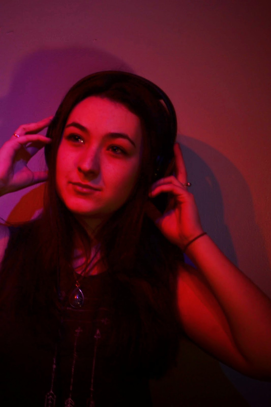
New Photo's for Contents Page
After i had received my feedback from my class mates and people via social media i had decided to go out and take new photos.I have completely changed my model with it now being a female model and i have ensured that i take up all of the white because that was the main issue with my rough cut.Down below i have taken a wide variety of different photos:


Friday, 3 April 2015
New Photo's Front Cover


I have decided to choose this photo for my media front cover. I kept the same inspiration from my original photo of Calvin Harris. The mise-en-sen that i decided on was for him to wear a blazer with a bright pink shirt underneath, unfortunately it did not come out as clear on the photo so i will be working on Photoshop to help bring my image out more. I decided to remove the glasses as i felt they did not match the image that i was going for.
Subscribe to:
Comments (Atom)


