Thursday, 7 May 2015
How I felt my video went
I feel that my video could of gone better because I don't feel that I have shown too many signs of technological implements however I think that the different camera styles that I used allowed me to be really effective and get my point across easier and more attractive.
Course
I have really enjoyed doing the Media Studies course because I have been able to learn a wide variety of new skills to help me improve my skills and help give me a better understanding of all the new software that we now have at our disposal. Furthermore I have been able to learn how to take more professional photo's with better use of lighting and camera shots, angles and movements. I have really enjoyed this year and I can not wait for the music video to begin.
Magazine
I feel that the magazine went well and that i have been able to develop my skills a lot through the different software's that i had used. Furthermore I feel that bu using different lighting, camera and editing techniques I was able to bring my magazine forward a evolve my skills to make the overall pages look better and more professional.
Wednesday, 6 May 2015
Blog
Throughout this project I have had to manage this blog, the reason why I did this was to keep my audience and examiners up to date on my project and I am able to explain how i have done it. I feel that the overall blog went well and that I was able to keep up to date with my Blog and that it contains a lot of detail and I was able to explain each stage of my production.
Final Recording Seventh Recording
For this Video clip on my final question (7) I filmed my self comparing my Preliminary task with my Final cut and trust me there is a massive difference in its overall appeal and ability. I have been able to recognize how this year has gone on to teach me a wide variety of different skills and tips which will make any future tasks that little bit more easier and a lot more enjoyable.
Sixth Recording
For this clip I had filmed myself and a few of my target audience members and asked them to analyse my final cut as well as my draft cuts to see whether or not I have improved and whether or not I have met their demand and needs. This was useful because I was able to see which direction my magazine was heading in and whether or not my target audience actually liked it.
Fifth Recording
For this clip I decided that my Introduction needed to be a lot more welcoming so I filmed a short video (Only about 30 seconds long), just to allow the viewer a better insight onto what the video is going to be about.
Fourth Recording
For this one (Q4), I decided not to record this part because whilst I was filming it the camera kept dying and after so much effort and long dreary hours I finally managed to film what I needed to do, however when it came to me downloading it onto my computer it was not there so I took it out looked on the camera and found out that somehow it deleted itself and all the footage that was left were all of my mistakes. I decided to not waste any more filming time and moved on. This mean that when I came back to it at a later date I typed it up into my video instead.
Third Recording
For this I decided to record myself, face to face with the camera about what I have learned from doing this and how I have learned all about the new technologies used (Question 6). I felt that this video went really well because I was able to say what I wanted and how I felt about the course in my own private way.
Second Recording
For this video i went on to film my Question 1. which involved having to talk about my magazine and comparing it to my role model/inspiration behind the whole design of my magazine and as I said before you will be unable to view them until they are complete.
First recording
I have just filmed my first video for question 4 (speaking to my target audience) and i gathered three people from my target audience, sat them down and asked them to describe what they liked and what they disliked about my final product. Shown below is an image of what my video looks like and you will be able to see the video until I have finished it.
Evaluation Video
I have decided to do a video to Evaluate how my products development went and how i can compare with the final output against any part of my developed stages/preliminary. I am going to be videoing it using the school's camera, Nikon d1500 and i will also be using a tripod and microphone to get better sound. Then once I go onto editing my video I will be using the software Adobe Premier Pro to ensure the best quality for my image and to give me some experience upon using the software for next year.
My Final hand in for my magazine
I have handed in my final magazine for my Front cover, Contents page and my double page spread. Shown below is what the outcome of my pages look like:


So what i did was after i had updated my contents page i made no extra improvements because i really like the overall layout of the page and i am very proud with the colour choices because i feel that it works really well with the theme of my magazine and it matches what my target audience would like to see. With my Front cover i really like how i used the lighting effect to really make the overall image much more prominent and look much more professional. Furthermore i really like the whole layout of the page with the stories being really clear down both the left and right hand side. Finally with my double page spread my favourite part of the page has to be the image because i really like the quality of the image as well as the the overall layout of the text and title. So overall i am very happy with how it turned out and if i am going to be honest i feel that i have out done myself.


So what i did was after i had updated my contents page i made no extra improvements because i really like the overall layout of the page and i am very proud with the colour choices because i feel that it works really well with the theme of my magazine and it matches what my target audience would like to see. With my Front cover i really like how i used the lighting effect to really make the overall image much more prominent and look much more professional. Furthermore i really like the whole layout of the page with the stories being really clear down both the left and right hand side. Finally with my double page spread my favourite part of the page has to be the image because i really like the quality of the image as well as the the overall layout of the text and title. So overall i am very happy with how it turned out and if i am going to be honest i feel that i have out done myself.
Update on Front cover
I have now done further update on my front cover by including a new image for my front cover and I have added a price, Issue number and a bar code to try and make my magazine more practical and more realistic I have also go onto re-structuring my overall style on the magazine. Below is what my new front cover looks like:
As you can see I have added an issue date on the bottom with the price and the bar-code in the top right of the page. I have also made the stories easier to read and more attractive. Furthermore i have increased the size of the title to make it look more appealing and more proffesional.
As you can see I have added an issue date on the bottom with the price and the bar-code in the top right of the page. I have also made the stories easier to read and more attractive. Furthermore i have increased the size of the title to make it look more appealing and more proffesional.
Contents Page Update
After I had received my responses I have completely re-done my page because there was to much pink and it looked really unprofessional. I have gone out and taken completely different photo's and I have changed the overall structure/layout of the page. As you have seen in a previous post I have taken photos of Emma
to try and mix it up and involve other people to improve my marks. Down below is what my contents page looks like at this current time:
I may also go on to handing this in as my final hand in, however i may go on to add more details on like bolder font style and possible adjusting the quality of the image.
fg
Thursday, 9 April 2015
Update on front cover
I have changed the layout of the front cover with there being a brand new photo which i have added because i was not happy with the overall quality of the image and i was not happy with the way he was positioned and what he was wearing. Down below i have shown what i have changed and how i have improved it:
First of all i had gone out and taken some brand new photos and i used the same model and i had taken inspiration from the front cover containing Calvin Harris by mixmag. I have done this by making ryan give a similar stance with a very serious face as well as going for similar clothes, like Blazer, Pink Shirt, hair style. This is going to be the photo that i am going to be using for my front cover because i was really happy with the overall quality of the image as well as the lighting being really nice the only thing i have changed is by removing the glasses because they did not work as well as i wanted.
Wednesday, 8 April 2015
New Photo's added to double page spread
In my double page spread i have decided to add a new photo in the bottom right of the page which works well and fills up the space well and i have stuck with the same story and same background picture because I feel like they work well and match my theme.
New Font Style
I have managed to include new font styles on my contents page and front cover. I have shown this on my contents page by having new text style down the side and with my front cover i have managed to include it everywhere across my page to make it look really attractive.
Tuesday, 7 April 2015
Double Page Spread update on story
Whilst i was checking my double page spread i was reading through the article that i had written and i came to the conclusion that it will need improving. To start with i felt that the story was too short and because it has been based on an interview i do not think there were enough questions asked and not enough detailed responses. Furthermore i feel i haven't given Ryan enough of a back story and because it is all about him he needs more information. Finally after doing some research into other fellow magazines i felt like trying to in cooperate some other people/artists to try and keep readers interested instead of becoming bored and unwilling to read more. I will be meeting all of my aims by going out doing further research on what questions to ask and what most readers will enjoy reading because even though i did some research earlier on in the year i feel it was not as useful as it should of bin.
New Style to my contents page
With my new structure to my Contents page i felt like changing some of my fonts around and see whether or not it works. After i replaced everything and moved the title's around i have used the fonts "Invaders", "Lucida Handwriting" and "Hobo STD". this is currently what my contents page looks like:
Monday, 6 April 2015
Explanation to why i kept the background white
After i handed in my rough cut version of my magazine i received feedback from people online and the number 1 improvement they advised was to fill the space. Now normally i would look to improve this but in order to gain marks i must take inspiration from a magazine that is already existing. The Magazine below is the one i have taken inspiration from:

As shown above i have tried to go along similar routes to help me gain as many marks as possible. The main part of the magazine that i have taken inspiration from is the white colour and the body positioning and mise-en sen.
Therefore i will be staying with the overall style of my front cover but i will be making modifications to the image and logo.
Sunday, 5 April 2015
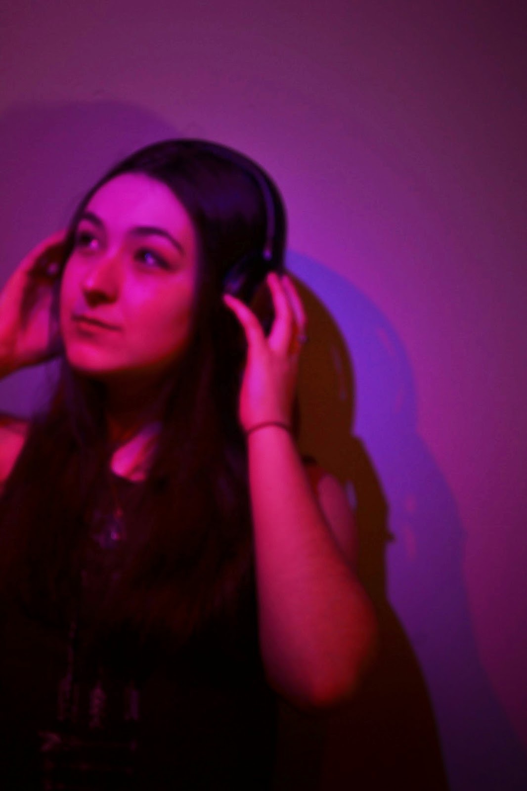
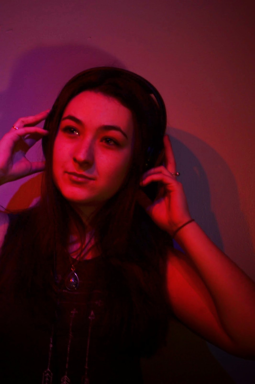
New Photo's for Contents Page
After i had received my feedback from my class mates and people via social media i had decided to go out and take new photos.I have completely changed my model with it now being a female model and i have ensured that i take up all of the white because that was the main issue with my rough cut.Down below i have taken a wide variety of different photos:


Friday, 3 April 2015
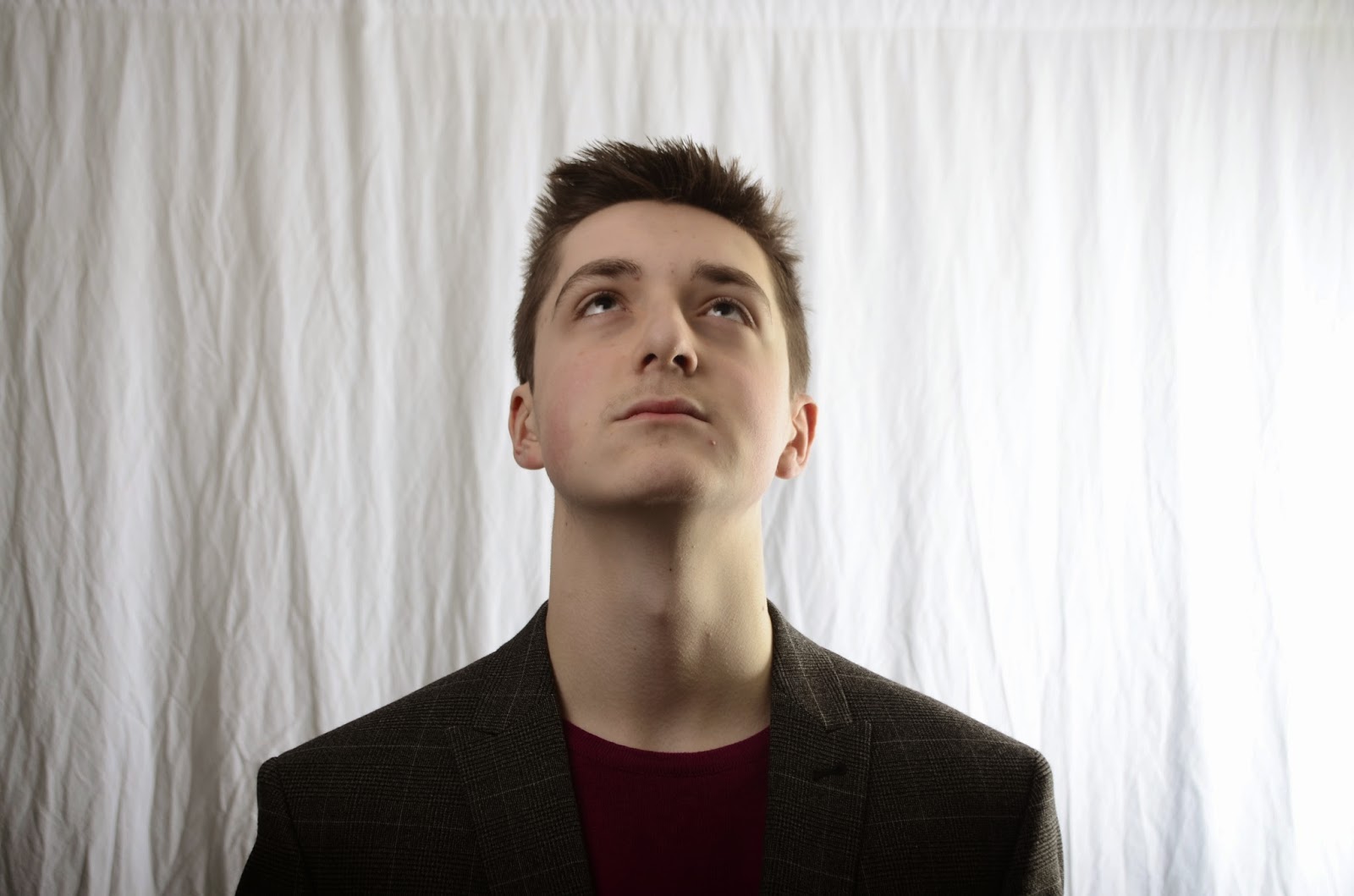
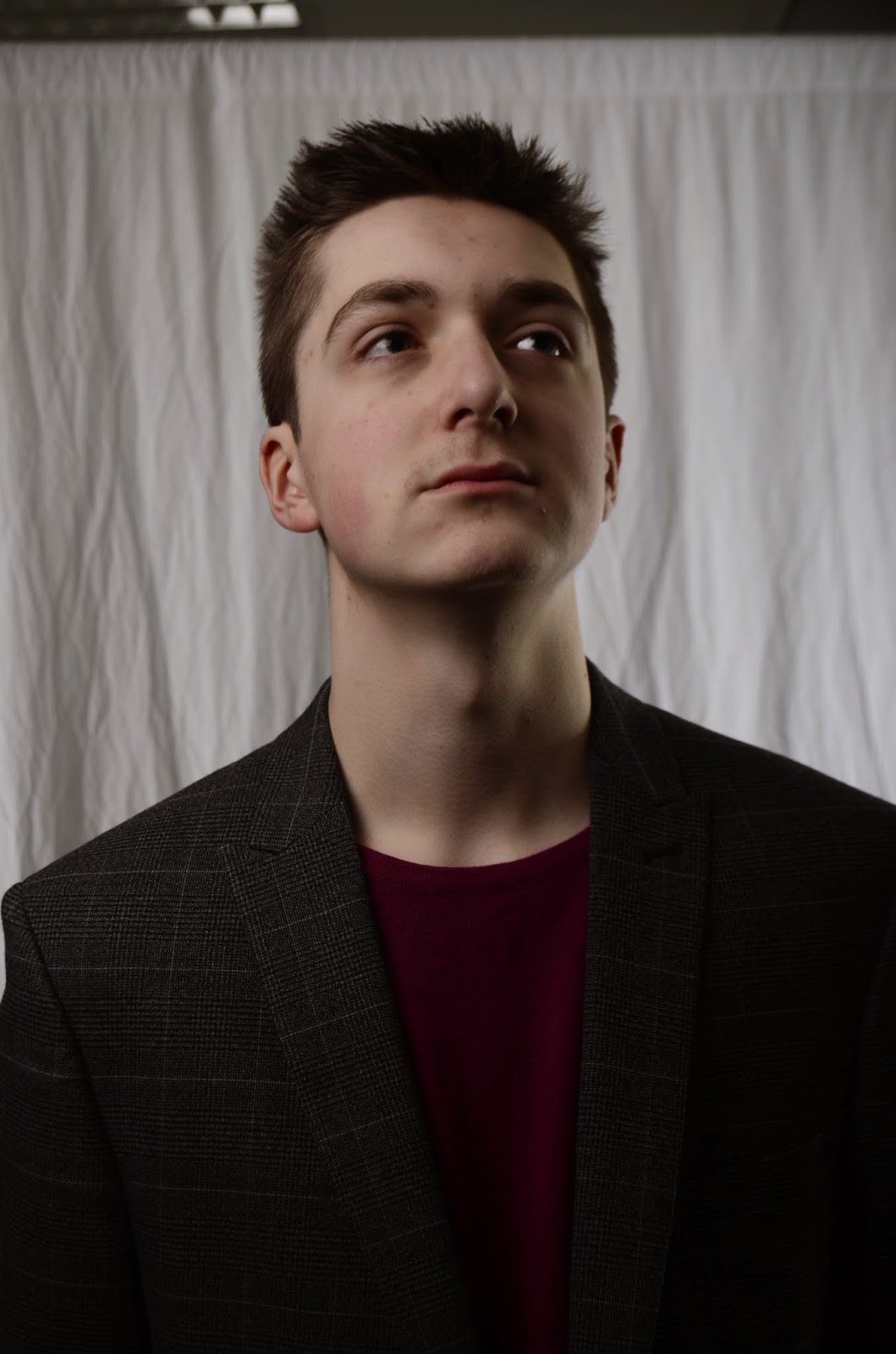
New Photo's Front Cover


I have decided to choose this photo for my media front cover. I kept the same inspiration from my original photo of Calvin Harris. The mise-en-sen that i decided on was for him to wear a blazer with a bright pink shirt underneath, unfortunately it did not come out as clear on the photo so i will be working on Photoshop to help bring my image out more. I decided to remove the glasses as i felt they did not match the image that i was going for.
Subscribe to:
Comments (Atom)


